November 14 meeting with Hyde Square Task Force Staff
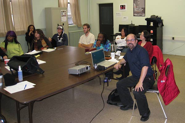
Above: Douglas Kornfeld meeting with the entire Hyde Square Task Force Staff to present his preliminary design for the sculpture to go in Mozart Park.
Notes from meeting and blog from November 14th 2008
A question of the "Coldness" of the materials for the piece.
I responded that durability factors required that either metal or stone be used rather than a softer material.
There was a great deal of discussion about the use of color.
Jesus asked if it would be possible to have a "rainbow" color scheme. I did not respond at the time but after further considering a "rainbow" color scheme I have very strong reservations. The addition of a large number of colors to the piece will be very difficult if not impossible to harmonize. The Breaking up of the surfaces with a number of colors will tend to fragment the design diminishing its scale. If the color were limited to the structure only - leaving the figures stainless - there would be a cacophony of textures and colors that would, in my opinion - disrupt the unity of the piece.
I raised the issue that if color were applied it would eliminate the possibility of incorporating a reflective surface on the figures. I also noted that maintenance was a major factor in the choice of stainless steel finish. A stainless steel surface would be maintenance free and last virtually forever. A painted surface could be expected to deteriorate in 15 years or less. I expressed my reservations about the city's ability/commitment to maintain the sculpture if the paint deteriorated. There were various suggestions about how color might be incorporated. Chrismaldi suggested that I might want to consider color along the edges.
Jon Neuburger wrote me after the meeting via the blog that perhaps I
might consider using color on the inside of the piece since the tower
is made of perforated metal.
I have since given this some thought and come to the conclusion that this is very impractical in terms of application and since all paint will eventually deteriorate the reapplication of the color would require the dismantling of the piece. Beyond the maintenance issue I have additional reservations. I don't think even a bright color applied inside the sculpture would make a strong impression being that the interior will be in shadow. I would offer the example of looking into a home window during the day. Unless there is a very strong light inside the room the color of the walls are not easy to determine.
My overall impression of the meeting was general approval of the design but some suggested that the issue of color be further explored.
I plan to take some time to work on the color issue. I will try using large blocks of color to minimize the disruption of structural harmony. I will also see if applying color to the corners of the design could work.
I realize that color is a VERY subjective issue. What is "beautiful" to some can seem unattractive to others. I recognize that there is a tradition of bright color in Latino art and I understand that this an important issue. I will work hard to see if there is any way that color can work with the overall design.